Liquid calories are fluids consumed as part of your daily diet that often go unnoticed and...
USDA Replaces Food Pyramid with MyPlate
By: Scottsdale Weight Loss Center
Published: June 6, 2011

Rock Climbing: Lose Weight on the Wall
If your weight loss efforts have hit a wall, why not climb it? Rock climbing is becoming an...
Weight Watchers vs. Medical Weight Loss Programs in Scottsdale: Comparing the Results
Many residents in Scottsdale, Phoenix, and Glendale struggle with weight loss plateaus despite...
Arizona Medical Weight Loss Programs vs Online Programs: Which One Provides the Best Results?
The weight loss landscape has shifted significantly with the rise of digital health platforms....
Is Brown Rice Healthier Than White Rice?
Is brown rice better than white rice? Intuitively, one would think that brown rice is much...
Tirzepatide vs. Semaglutide: Which Weight Loss Medication is Better?
Modern medical weight loss has been changed by the arrival of highly effective prescription...
Health teachers and school cafeterias in Scottsdale and Phoenix, Arizona are still adjusting to the bombshell news offered up by First Lady Michelle Obama recently: the food pyramid no longer exists. First introduced back in 1992, the previous food pyramid was intent on educating the nation’s youth about healthy eating habits. The basis of the food pyramid was a graphic that represented the recommended number of servings for each food group per day. Unfortunately, the food pyramid wasn’t as well balanced as it could have been. It’s no wonder obesity and heart disease are a problem, especially considering the food pyramid’s instructions to eat 6-11 servings of carbs each day.
It seems as though the balancing act that was the food pyramid has been recognized for what it was: flawed. Instead, the USDA has introduced an even simpler graphic to represent what people should be eating. It’s called MyPlate. MyPlate reduces words to a bare minimum and gives a very clear suggestion of what each person should be eating at each meal in a pie graph form. Instead of thinking about how many servings of each food group you’ve eaten each day, MyPlate gives you a visual of what your plate should look like at each meal using proportions.
Vegetables and fruits represent half of MyPlate. Grains make up a little more than half of the remaining 50% of the plate, with protein taking up the rest. Dairy is represented by a glass near the upper right hand corner of the plate. While the proportions of MyPlate are healthier, the graphic leaves out some important information. Fat and salt are no longer represented, and the size of the plate isn’t discussed, meaning people may take liberties with the size of their meals.
The changes set forth by MyPlate are a step forward in helping people across the US to lose weight — if they eat reasonable portions and watch their fat intake. On the other hand, if people take liberties with plate and portion size, no real changes will come. Only time will tell if MyPlate has an effect on the size of waistlines across the country.
Nick
Nick's Story
"I wish I would have come here first. We spend all our time reacting to the next great weight loss tip or program. It might work for a while, but does not last and we end up yo-yoing from one fad to the next – as we gain more weight." Read More

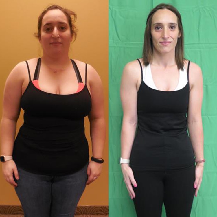
Gina
Lost 44.5 lbs
"I had no trouble adhering to the meals and they really helped catapult my progress! The classes were so beneficial to me because they helped change my thinking about how I viewed health, nutrition, and fitness.
I will always have my relationship with Scottsdale Weight Loss Center. They truly helped me change my life forever." Read More

Lauren
Lost 60 lbs
"Dr. Ziltzer and everyone who I have come in contact with at the Scottsdale Weight Loss office have been so encouraging and I look forward to seeing them each week. It is now a year and 2 months later since I started. I am down 60 lbs., which is the average amount a 9-year-old weighs, it is crazy to think I lost a whole person! I feel amazing, I hit my goal weight in November 2021 just before Thanksgiving. Nothing on my body hurts anymore..." Read More

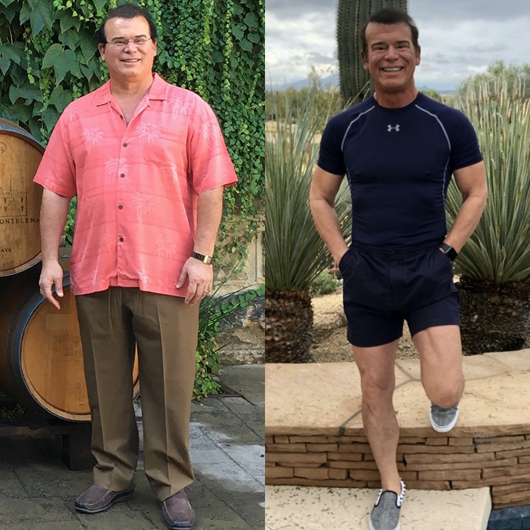
Chuck
Lost 66 lbs
"The best thing I did was call the Scottsdale Weight Loss Center. I have a lot more energy, I'm not hungry, and it feels great.
You can take it from me that this is a program that produces results. The staff is always positive, supportive, and never judgmental.
Your visits always result in positive reinforcement, no matter if you had a good week or a bad week." Read More
Emily
Lost 101 lbs
"Here I am at the lowest I have been since high school weighing in at 155lbs. I have lost 101 lbs, BMI of 39 when I started, to 21.6, and of course at body fat % of 47.1 to 26.5%. I told myself by my 30th birthday I wanted to be confident in the way I look and I owe it all to SWLC. The entire staff is so welcoming and they are rooting for you just as much as you are rooting for yourself...." Read More
Reviews
Meet Our Team

Robert Ziltzer, MD, FACP, FAAP, FOMA
Obesity Medicine Certified Physician

Diana Bone, FNP-C
Specializing in Obesity Medicine

Craig Primack, MD, FACP, FAAP, MFOMA
Obesity Medicine Certified Physician

Kristen Ash, FNP-C, FNP-BC
Nurse Practitioner
Alicia Earley, FNP-C
Family Nurse Practitioner